5 Home Design Mistakes You Don’t Want to Make
Published: June 22nd, 2015
Ever walk into a home and sense that something is wrong, but you can’t quite put your finger on it? When that happens to me, I immediately turn my attention to the 5 most common home design mistakes homeowners make. Here they are:
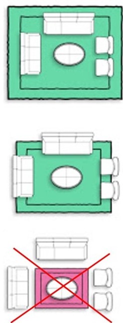
1. Your Rug is Too Small or Too Large
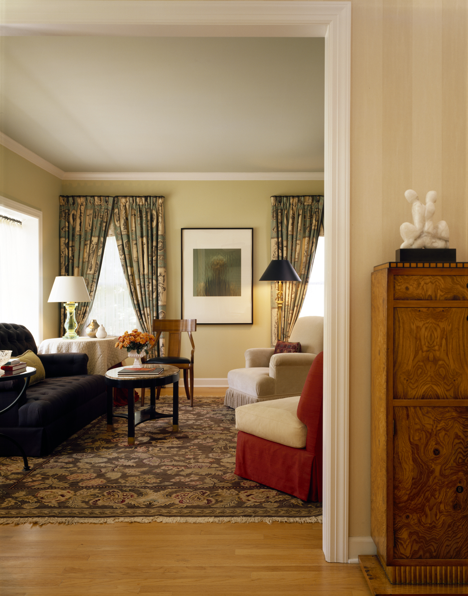
The wrong size rug can really throw off your sense of proportion and scale in a room. If it’s too small, it can make the room feel as empty as a vault, especially when the furniture is crowded around it. If the rug is too large, the furniture feels like it belongs in a dollhouse or is spaced uncomfortably far apart. A right size rug should anchor the furniture. Usually, this means that your sofas and chairs will either sit entirely on the rug or sit half on and half off. When it’s just right, the distance between pieces feels sufficiently intimate for conversation without sacrificing personal space.
2. You Missed Your Plane
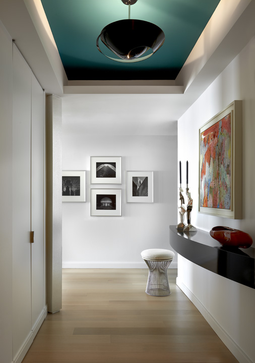
The ceiling, that is… sometimes called the “5th plane.” There is no law requiring you to paint your ceiling white! Liven up the space by painting the ceiling a fun bright color. Paint it dark to give it a high ceiling effect. Better yet, wallpaper it! For more on ceiling design, check out a couple of my earlier posts: “Ceiling Design: The Forgotten Fifth Plane,” and “3 Quick Tricks to Get That High Ceiling Effect”
3. You Lost Your Light
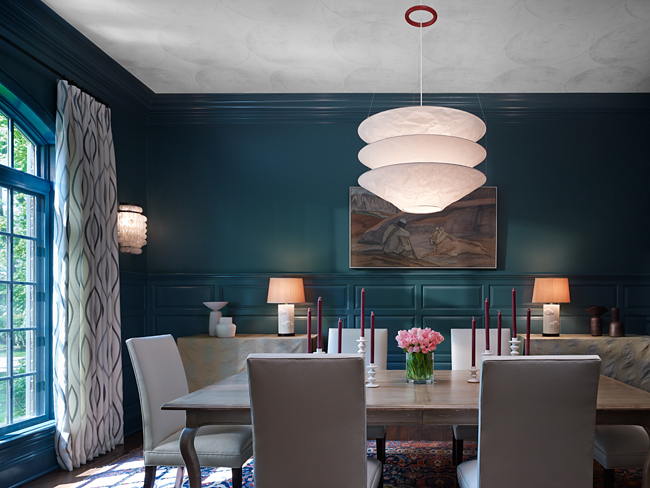
So often I see homes with only one light source — can lights. Lighting isn’t just for function, but for establishing mood, adding color, and providing depth. To achieve a desired effect, think of lighting like 3 layers of a cake. Start at the ceiling with a pendant, then light the center of the room with a sconce, then the lower half of the room with lamps. Layering the lighting in this way will give you both the function and ambience you desire.
4. You Accidentally Created “High” Art
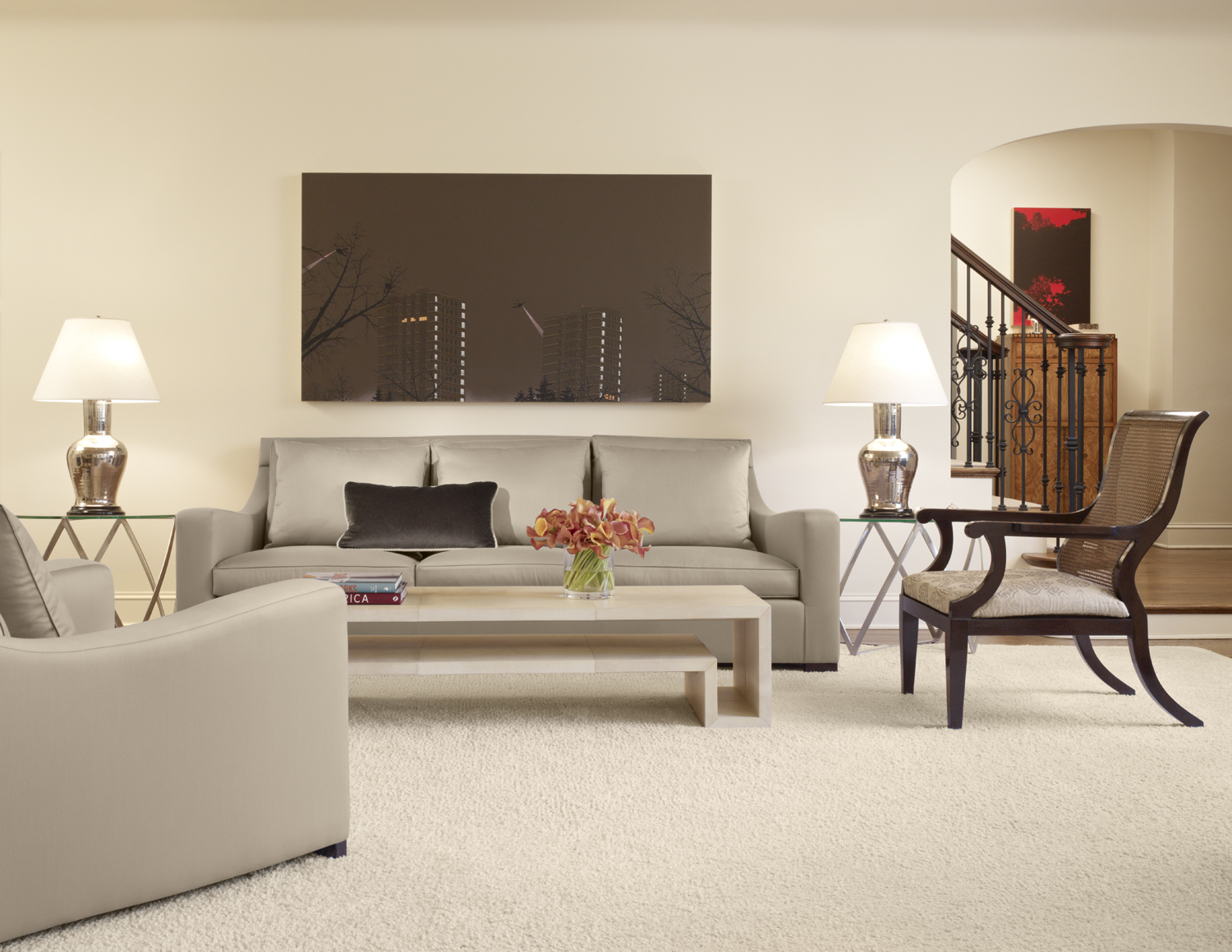
Art can stamp a room with your personal character, but if it’s placed too high, it feels disconnected and disconcerting. Instead place the artwork closer to the furniture so that it’s part of the composition of the room.
5. Who Needs a Plan?
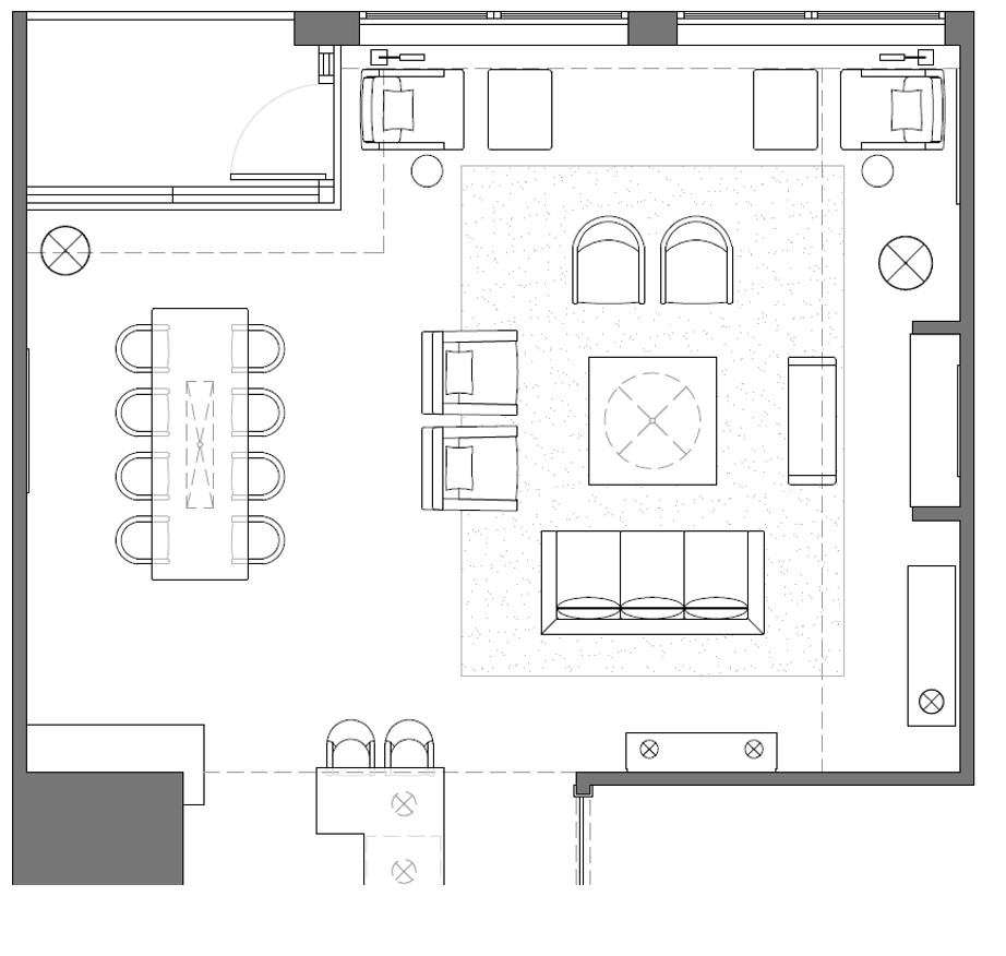
You do! There’s nothing worse than buying a sofa that doesn’t fit in your space because you forgot to measure. Before you do any design work in your home, think about what type of furniture pieces you need, the size and proportion of those pieces, and make sure to measure the room. For a great smartphone app that helps with this, try PhotoMeasure. And don’t just buy one piece of furniture without knowing what else is going in the room and how each piece will relate to each other. Is everything properly proportioned? Do the colors,styles and textures create just the right balance of continuity and contrast, personality and comfort? The crux of great design is a great plan, so invest in it.
All of these mistakes are easy to make, but even easier to avoid! Make the fix, and you’ll find a much more appealing room waiting for you. Let me know what you think.

