5 Ways to Contemporize The Face of Your Traditional Home
Published: June 1st, 2015
If you are thinking about moving from a contemporary condo to a traditional home, you probably want to retain the more spacious, contemporary feel of the condo despite your new home’s traditional appearance. You might even want to still use those great mid-century modern furnishings that worked so well in the condo. Blending contemporary style with traditional architecture can work well, but it can still be jarring when the exterior and interior seem completely unrelated to each other — a bit like Lady GaGa wearing a schoolgirl’s uniform!
No worries. It doesn’t take a huge architectural remodeling budget to smooth out that transition so that what you see on the outside is what you get on the inside. A few simple interior design strategies for the exterior face can make all the difference and still retain charm and warmth.
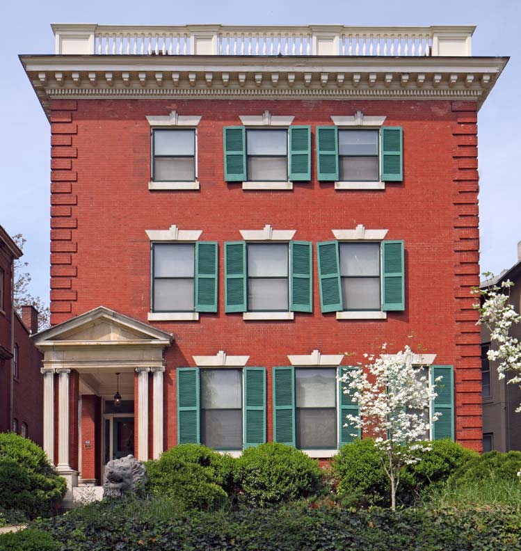
Take this 1900’s federal style home. Typical of this period, the green shutters and white moldings complement the red brick.

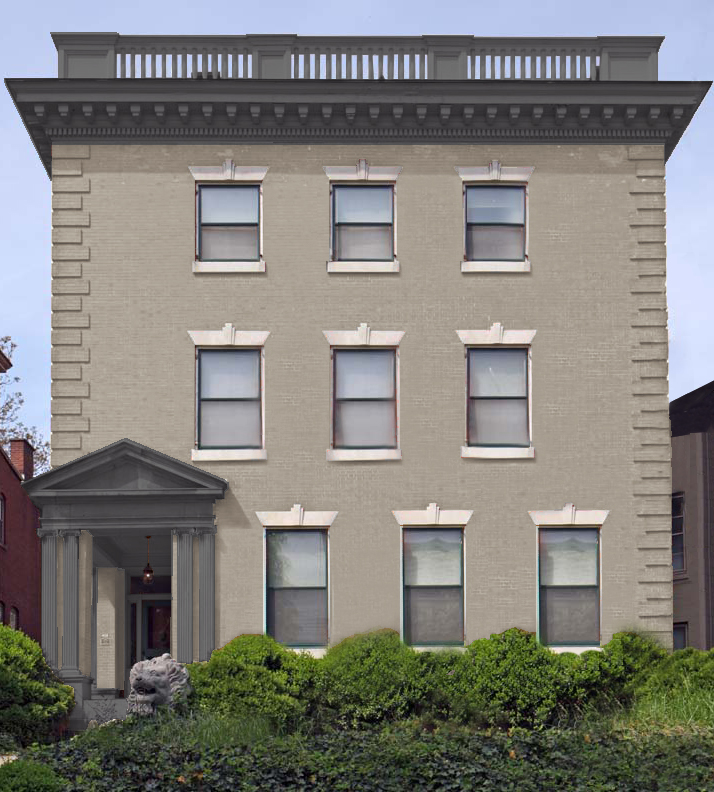
In order to give the home a more contemporary look, let’s start by removing the shutters, sort of like changing the accessories in a traditional room. The exterior white trim of the balustrade, cornice and portico still reinforces a colonial feel, so let’s use color to streamline it a bit more. How about painting them with Benjamin Moore Aura Grand Entrance in a charcoal color? The red brick could also stand a coat of paint. Maybe a light gray/ beige, but let’s keep the limestone lintels and sills the same, in order to blend the traditional architecture with the simpler and more unified contemporary look.

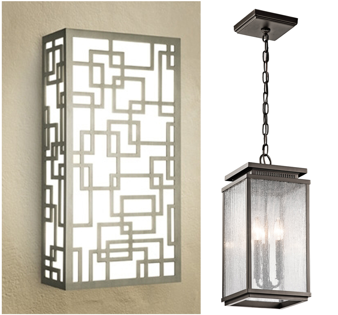
Now let’s talk lighting. Modern, updated fixtures will work better now against the more streamlined, gray exterior. The geometric pattern of a wall sconce by Boyd lighting could create a warm and inviting entrance, while this transitional pendant from Lightology is just the right blend of styles to join an eclectic exterior with a contemporary interior.

Lastly, time to simplify and accessorize. Let’s clean up the landscaping a bit and add new and simpler signage like these stainless steel address numbers. Just like decluttering a room, the exterior now looks simple and straightforward, creating a home that’s congruent inside and out.

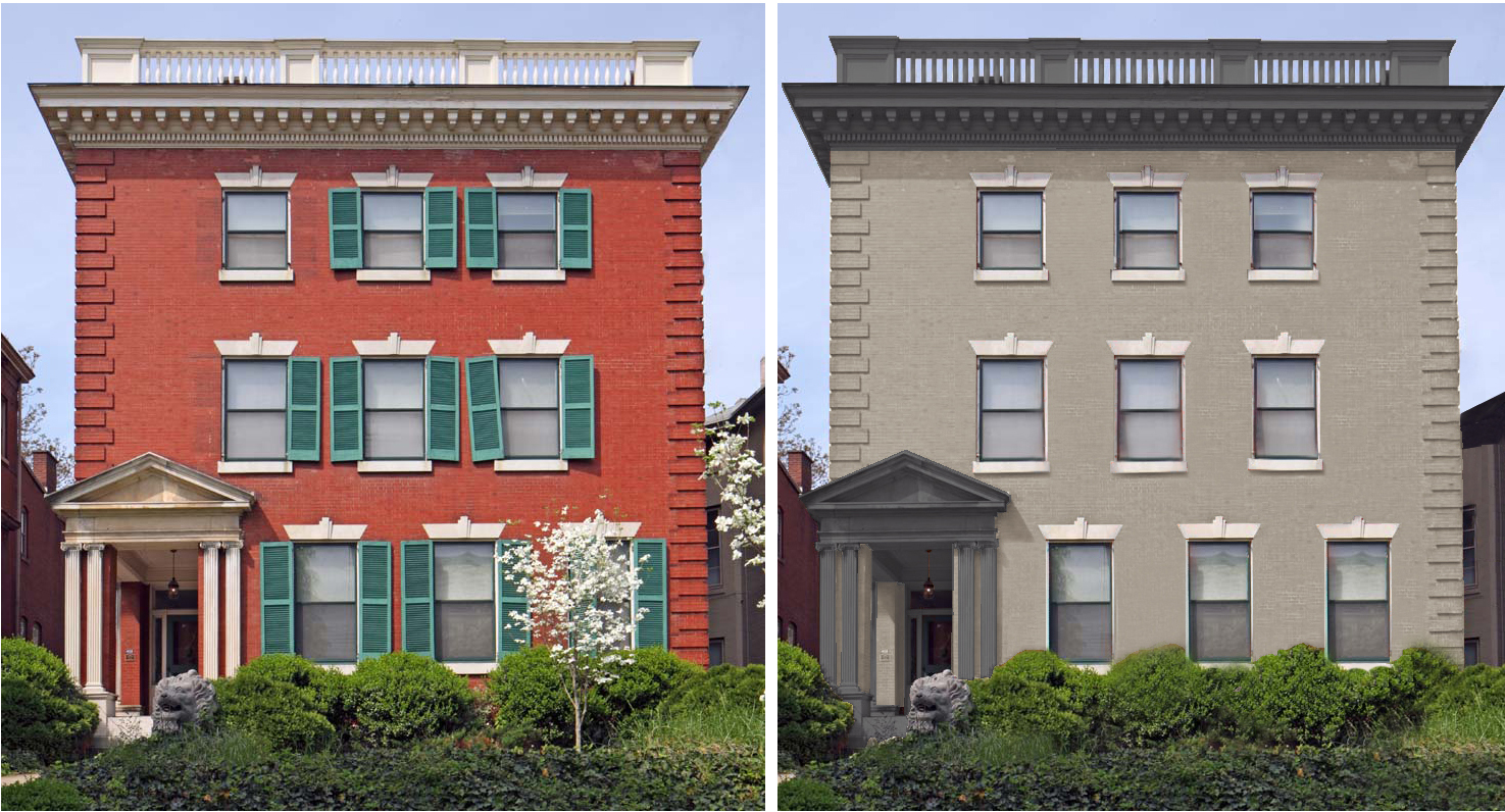
So no need to fear the mismatch between the contemporary interior you want and the staid exterior architecture you have. Interior design touches applied to the exterior are all you need to create that “What-You-See-Is-What-You-Get” effect. With a little help from Photoshop, here’s the before and after. What do you think?

