Ceiling Design: The Forgotten Fifth Plane
Published: October 1st, 2012

It doesn’t take a Michelangelo to understand the importance of ceilings. Yet when it comes to modern homes, we sometimes overlook this integral design element, filling a room with beautiful furniture, installing expensive floors, placing exquisite artwork on the walls, only to leave the ceiling painted white!
Ceilings are often uninterrupted planes – no door openings and, except perhaps for an occasional skylight, no windows. This empty canvas therefore creates a perfect opportunity to amplify a design concept, divide or redistribute space, or even fix a design problem.
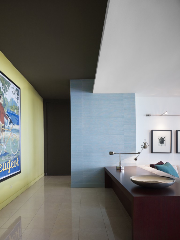
For example, in this modern high-rise apartment built in the 1960s, the 8-foot ceiling height felt menacingly low. In contrast to lightly colored adjacent walls. we painted the ceiling and the far wall a dark brown . Now, they both disappear into the depth of this rich and soothing color.

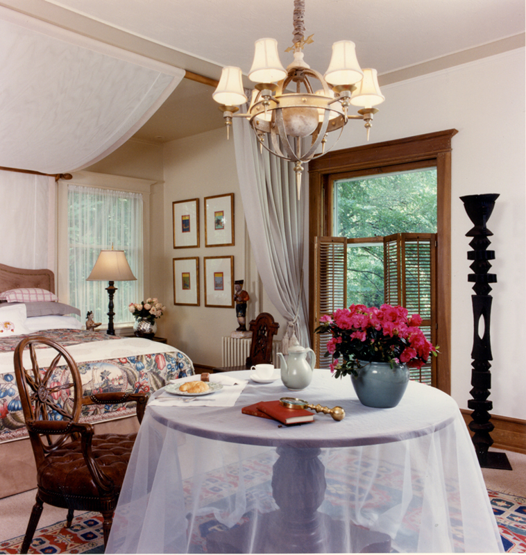
This bedroom we designed for an ASID Show House (below) reveals how we used the ceiling to redistribute space. By adding a ceiling molding and using two different colors on the ceiling, we created the illusion of two distinct spaces in one room: a sleeping alcove and a sitting area. The fabric canopy accentuates the separation between the two spaces.

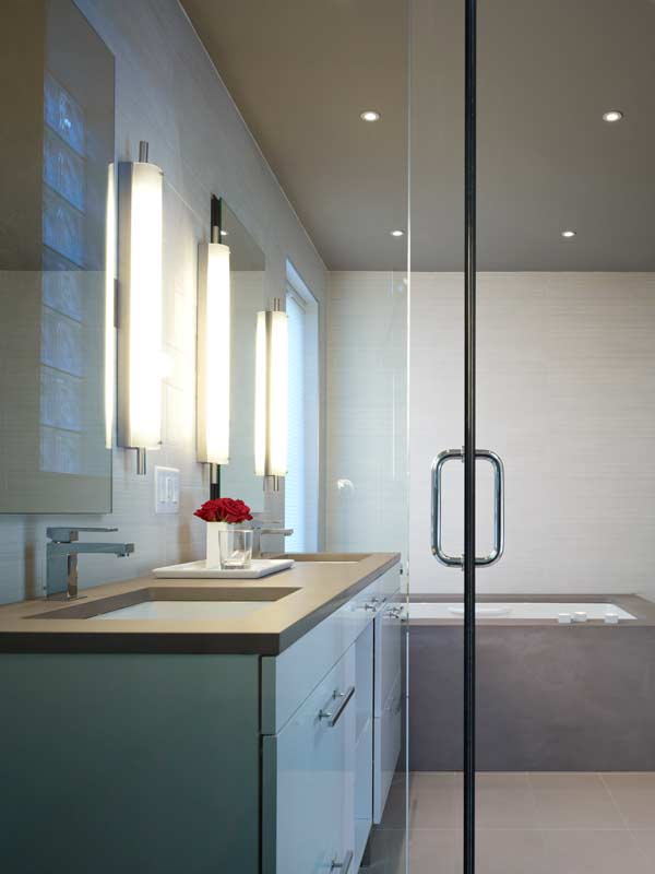
Finally, here’s a subtle take on using the ceiling to extend and amplify design elements. This minimal master bath is a study in white and gray planes and volumes. Painting the ceiling a taupe-y gray draws attention to the tub and counter stone and gives definition to the white tiled walls. Click to see more on this project.
Of course, no design project can equal the challenge of the Sistine Chapel, but even Michelangelo understood that good design is good art.

