A Delicious Kitchen Re-Do
Published: October 19th, 2017
In 2015, I posted a piece about continuity and contrast, noting that “(they) are among the most important tools I have for imbuing a space with interest and personality.” Our recent design for a kitchen in a charming English cottage-style North Shore home is a perfect opportunity to demonstrate this!
We previously designed most of the public spaces in this home, introducing sleeker, more contemporary elements to contrast with the home’s existing casual textures of rough timber and earthy brick. The result is a luxury residence with a surprisingly sophisticated and energetic charm.
How do we extend that look into our design for a new kitchen? We go for that same sophistication by balancing continuity and contrast in materials, textures and color: organic and machined, rough and smooth, matte and glossy, saturated and neutrals. Here’s the tasty mix we’ve cooked up.
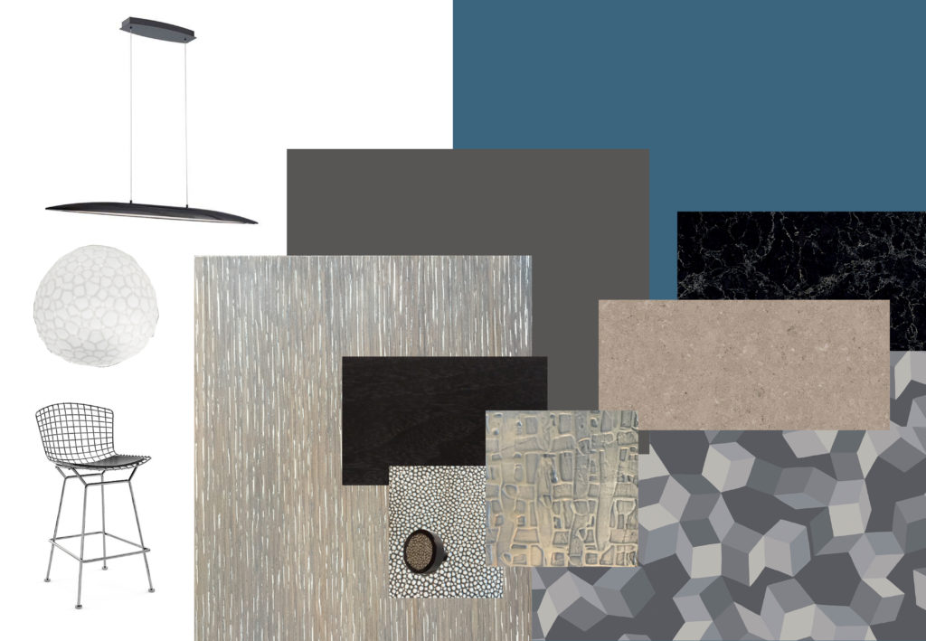
A wall of warmly colored rift cut oak cabinets in a cerused and wire brushed finish will contrast beautifully with a separate set of cabinets in a machined look of white bronze metal by Great Lakes Metal Coating, framed in dark espresso.
We’ll amp up that machine quality with an accent wall covered in a Cole and Son wallpaper called “Puzzle” that provides a bit of 3-D optical illusion. We’ll echo the faceted dimension of the wallpaper with four ceiling mounted light fixtures called “Meteorite” that add a wonderful texture to the space. And check out the cabinet knobs in matte black finish with an Edelman Leather inset. Smooth, rich and textured in one little pull!
A generous kitchen island will feature a dark Caesar Stone surface called “Vanilla Noir.” The island, surrounded by Bertoia Counter Stools in chrome, will be stunningly illuminated by a sleek ebony Davos fixture. The drama of the island will be accentuated by a much lighter Caesar Stone surface, appropriately named “Shitaki,” that wraps around the perimeter of the space.
To enliven the otherwise neutral color scheme, we’ve selected a richly saturated teal called “Fiji” by Benjamin Moore, for the walls and back painted glass back splash. The high gloss of the back splash adds just the right contemporary note.
The collage below gives you a taste of all the different flavors we’ve pulled together for this delicious kitchen re-do. Can’t wait to serve up the finished work!

