Continuity and Contrast: Finding the Right Balance
Published: March 23rd, 2015
One of the challenges in any art, including interior design, is to find the perfect balance between continuity and contrast. When we do, we create just the right effect and convey something essential. As an interior designer, continuity and contrast are among the most important tools I have for imbuing a space with interest and personality. I find examples of this all around me in Chicago, where I encounter stunning examples in both architecture and art. Take this David Hockney painting, one of my favorites at Chicago’s Art Institute.
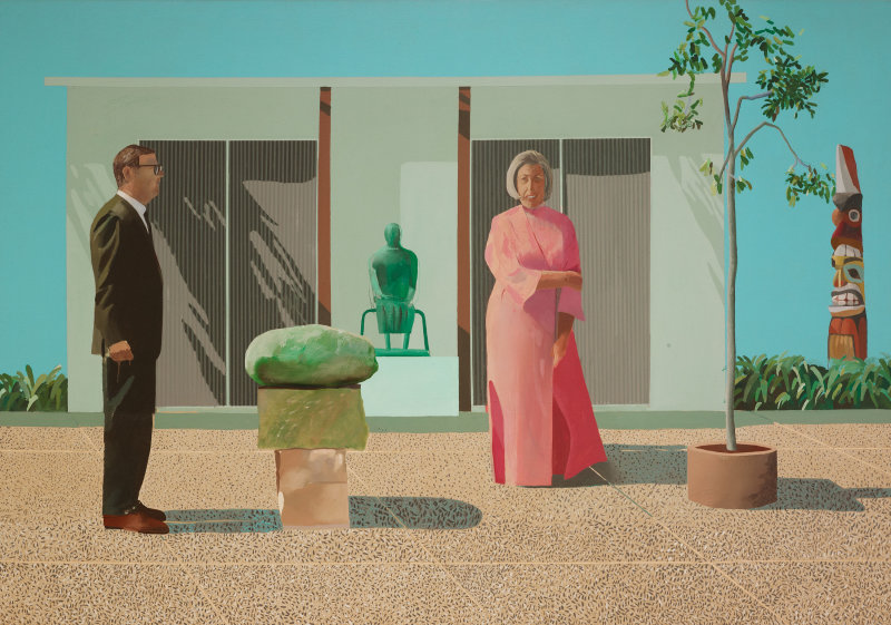
The modern, minimalist space of a couple’s sculpture garden is reinforced by the pose of the couple who appear like statues themselves. The woman’s smile even mimics the totem pole in the background. The continuity extends to the vertical lines of the structure behind them and the soft greens shared by statues, leaves and plants. The barrenness of the small tree accentuates the stark and empty nature of the scene. Now look at how Hockney uses contrast to amplify the effect. There is the bold interplay of light and shadow; and notice how the pink of the woman’s robe punctuates the vacant exterior of the home and the grid of sand-colored pavement beneath her. The colors themselves, which in other settings might seem joyful, only reinforce the void of this place. Hockney’s work is a study in how the perfect balance of continuity and contrast creates the intended effect (even a grim one!), communicating both personality and relationship.
Here’s an example of the same principle applied architecturally to one of my favorite buildings in Chicago’s skyline, 333 W. Wacker. This time, though, we experience exuberance and wonder.
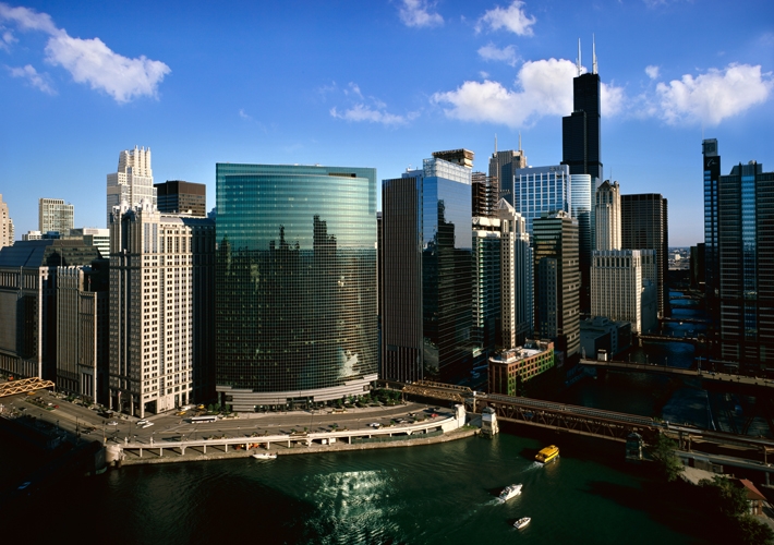
Note how the architects create continuity in a couple of ways. The curve of the building perfectly follows the graceful bend in the Chicago River and the river’s color coolly matches the building’s glass skin. Yet the contrast with the more traditional high-rise office buildings on either side of the structure only accentuates 333 Wacker’s spectacular presence, giving it an enduring excitement and power.
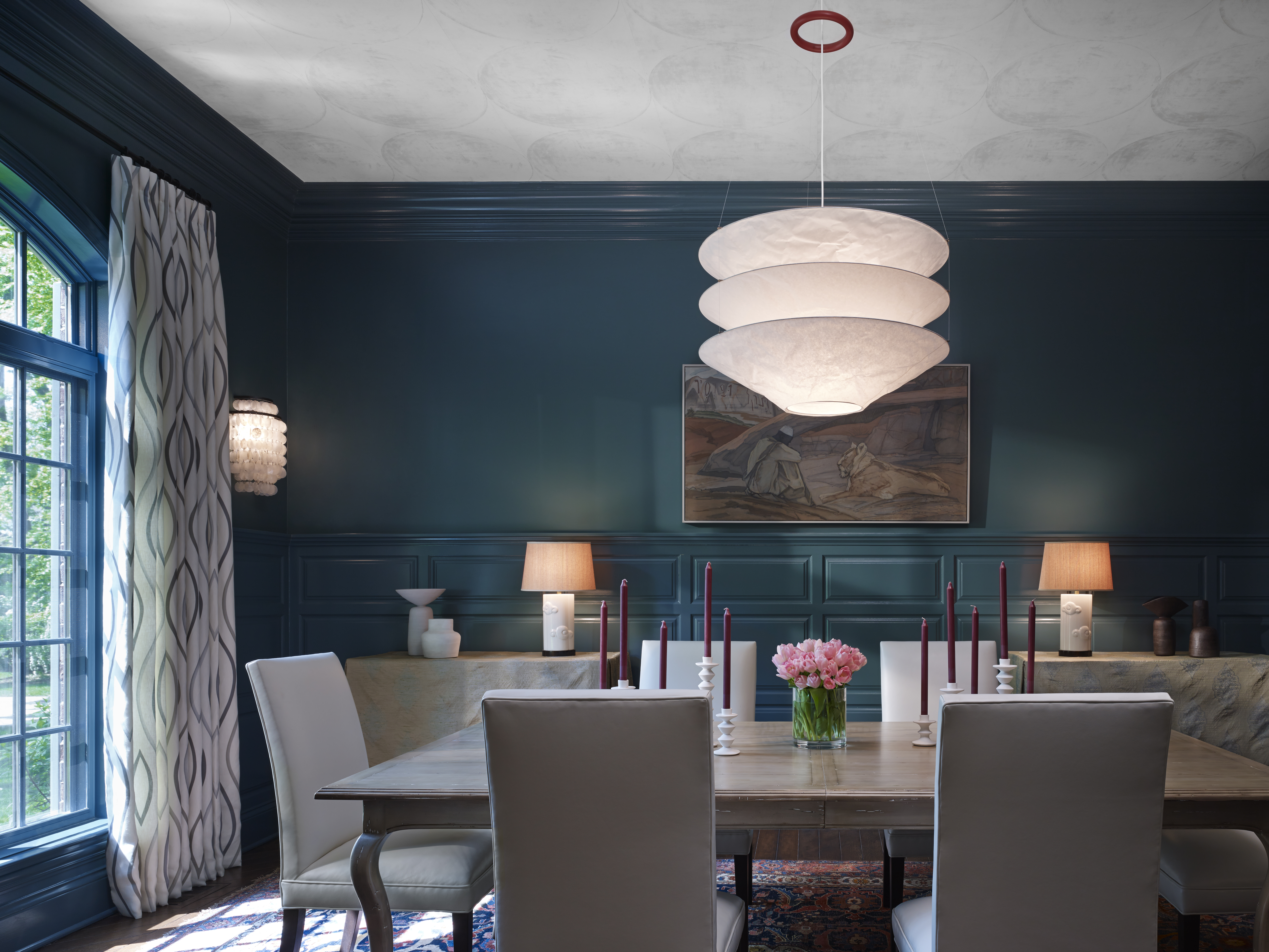
As in art and architecture, the proportion of continuity and contrast in an interior design determines the overall feeling, personality and style of the space. A high percentage of continuity can be soothing and restful, while lots of contrast is dramatic and dynamic. Sometimes a single object can provide both. For example, the first item I chose for this dining room was the striking Ingo Maurer light fixture over the dining table, because it reflects the casual, forward-looking personalities of my clients. While it clearly contrasts with the more traditional, formal characteristics of the room such as the moldings and panelling, I introduce continuity by repeating the form of the fixture elsewhere in the room: the circles in the ceiling wallpaper, the wall sconce adjacent to the window, and the candlesticks on the table. A more subtle echo is even found in the geometric pattern of the drapes. This balance of contrast and continuity imaginatively conveys the youthfulness of its owners.
I can use any number of dimensions to hit the right mark between continuity and contrast: color, material, finish, texture, scale, historical period or form and geometry. When I strike that balance, a clear reflection of the owner emerges, be it playfulness or formality, complexity or casual refinement. The result not only gives the room a certain “feel” but tells us something essential about the owners, their lives, and their way of life. It’s why I love what I do, and why I contend that great interior design is indeed great art.